Selected work
Three builds. Three tiers. One standard.
Three example builds, one at each tier. No stock templates, no filler — every page hand-coded, here so you can see the range before we ever talk.
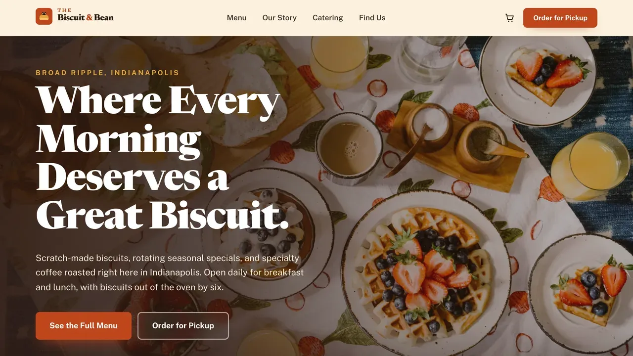
Example build · Tier 1 · Launch
The Biscuit & Bean
café & coffee shop
A café gets judged on its website before anyone tastes the coffee. I built this one to look warm and established the second it loads, so someone deciding where to go in the morning trusts it enough to actually show up.
What this demonstrates
- A focused 4-page Launch build.
- Sharp, fast, and welcoming without a single template.
- Proof that small doesn’t mean basic.
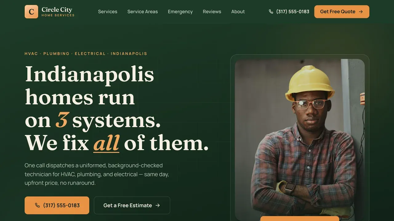
Example build · Tier 2 · Growth
Circle City Home Services
home services — HVAC, plumbing, electrical
When you run three trades, the website’s whole job is helping a stressed homeowner find their problem fast. I built this so someone with a dead furnace lands, sees that you fix furnaces, and calls, without digging through a menu.
What this demonstrates
- A fuller 7-page Growth build.
- Room for services, service areas, and proof.
- Structure that turns a complex trade business into something easy to navigate and easy to call.
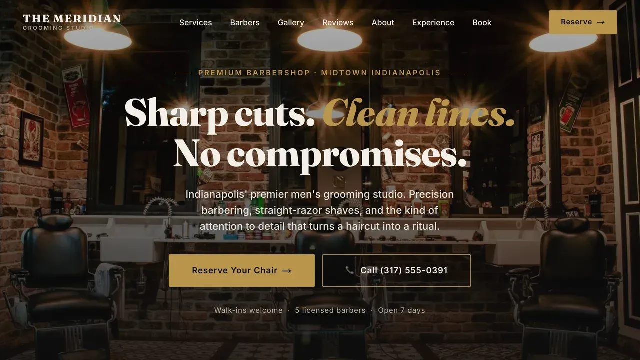
Example build · Tier 3 · Signature
The Meridian
grooming studio / barbershop
A premium shop has to look premium before the first appointment. I built this as a Signature-tier build so the polish sells for you. It makes someone expect a better experience, and pay for it.
What this demonstrates
- An 8-page Signature build.
- The kind of finish a customer feels even if they couldn’t tell you why.
- What the top tier actually looks like.
These three don’t share a palette — because they shouldn’t. Each one is built for its own business, not stamped from a template. That’s the whole point.
The ideal home-services homepage
Here’s how I think about a homepage that actually gets the phone ringing — every piece, and why it sits where it does.
Sticky call button in the thumb zone
On a phone, the call button never scrolls away. Most of your visitors are standing in a driveway or a parking lot; calling has to be one thumb-tap from anywhere.
A headline that names the job, not the brand
“Indianapolis HVAC, fixed today” beats “Welcome to our website.” The visitor decides in two seconds whether you do their thing — so the headline says their thing.
Reviews under the headline, not buried
Trust goes up top. A row of stars and a real count right under the H1 answers “can I trust this person” before they scroll.
Services as plain answers, not a menu
Owners list services like a directory. Buyers scan for “do they fix MY problem.” Each service leads with the problem it solves.
Speed as the silent close
The page loads instantly on cellular. A site that hangs for three seconds on a contractor’s phone loses the call before the pitch.
One obvious next step
No maze of links. Call, or see a demo. A homepage with five competing CTAs has none.